ShopDreamUp AI ArtDreamUp

Deviation Actions


Suggested Deviants


Suggested Collections


You Might Like…


Featured in Groups


Description
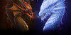
After deciding that the other artwork is better fit to be a chapter cover, I have after some deliberation made this as the cover for the comic.
I wanted to do something different that the usual "protagonist striking a pose at the camera" or "group of main characters with protagonist in the middle and the others slightly behind him" standard comic covers.. this was the idea I had. I like the way it looks, but I'm not sure it says a lot about what the comic is like, and maybe it's also a little dark?
I mean, the comic is mostly a fun fantasy adventure story - it's got its serious moments and even a few dark, gritty scenes. But that's not the main element. What kind of a story would you expect from this?
The shape in the background, btw, is a stylized ivy leave, an element that's relevant to the story.
I appreciate any constructive feedback! How could I make this a better cover illustration for my comic?
Lessandero and "Bolt as Brass" belong to me!
reference for anatomy: fav.me/d9qawuj
Image size
1748x2480px 878.07 KB
© 2016 - 2024 nihidea
Comments50
Join the community to add your comment. Already a deviant? Log In
Hello! I hope you don't mind that I might be too rough and nip picky.
Seeing this piece the one thing I noticed is that I wasn't really attracted to it. I think It's because of how you colored it. Adding the blue to the background detracts the eye to what I think the main focus is; the male and the title. What would fix this is to turn the background grey. A dark grey or sort of medium grey would be good. Also get rid of the white glow in the ivy leaf around his head. I think it's a bit much and again detracts from the focus area. I think the anatomy on the male looks very nice and I think you did really well on it. To make it better I think it would be wise to add a bit more black. Adding more shadows would make him look more interesting and make him feel more alive. For the tattoos it would be really cool if you can make them look like a glowing blue. It would make it look so much more interesting. In some areas it seems not done. Before you post a picture it would be wise to zoom in to check all mistakes. The text looks kinda confusing. I couldn't easily tell the L was supposed to be the L. Also the text looks kinda boring. I don't really know how to explain it. It's almost as if it doesnt match the dark gritty look of the picture. Also in your description you said the comic will be a fun adventure story, Your picture says otherwise. What I see in this picture is a dark and gritty comic. If you want people to think this is a fun fantasy story make sure the cover looks fun and colorful. Make it seem like your character is having fun with magic and other fantasy. When people walk around the comic store they tend to judge the story by its cover. This is why you need your cover to say alot of the story. Sometimes cliques tend to be the best. You don't have to be unique all the time. Other then that I think this is an okay piece. It's not great but it's also not the worst. I really hope this helps. (Smile)")
Seeing this piece the one thing I noticed is that I wasn't really attracted to it. I think It's because of how you colored it. Adding the blue to the background detracts the eye to what I think the main focus is; the male and the title. What would fix this is to turn the background grey. A dark grey or sort of medium grey would be good. Also get rid of the white glow in the ivy leaf around his head. I think it's a bit much and again detracts from the focus area. I think the anatomy on the male looks very nice and I think you did really well on it. To make it better I think it would be wise to add a bit more black. Adding more shadows would make him look more interesting and make him feel more alive. For the tattoos it would be really cool if you can make them look like a glowing blue. It would make it look so much more interesting. In some areas it seems not done. Before you post a picture it would be wise to zoom in to check all mistakes. The text looks kinda confusing. I couldn't easily tell the L was supposed to be the L. Also the text looks kinda boring. I don't really know how to explain it. It's almost as if it doesnt match the dark gritty look of the picture. Also in your description you said the comic will be a fun adventure story, Your picture says otherwise. What I see in this picture is a dark and gritty comic. If you want people to think this is a fun fantasy story make sure the cover looks fun and colorful. Make it seem like your character is having fun with magic and other fantasy. When people walk around the comic store they tend to judge the story by its cover. This is why you need your cover to say alot of the story. Sometimes cliques tend to be the best. You don't have to be unique all the time. Other then that I think this is an okay piece. It's not great but it's also not the worst. I really hope this helps.